
I’ve been meaning to start write posts on this blog where I go over how I make and publish my projects. I’ve spent a lot of time researching for tools and resources to make my life easier as a Maker, Content Creator, and a Freelancer, and am a huge believer in “No need to reinvent the wheel.”
If the products or resources are out there for you to use to make launching easier, then you should know about them, and you should utilize them! (Especially if they’re free!)
(There are some referral links here, but they’re there because I LOVE them!)
hiroko.io
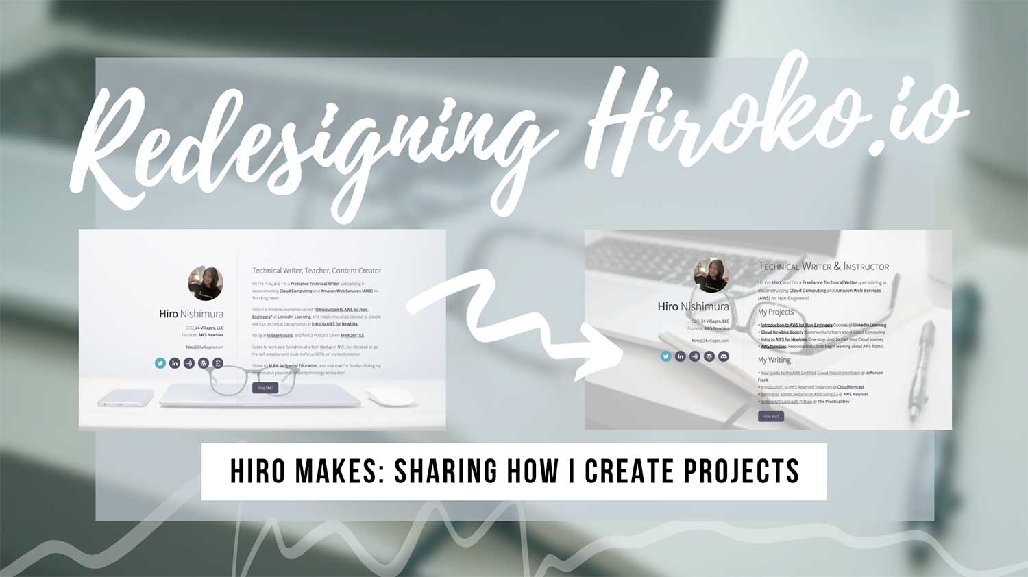
Today, I updated hiroko.io. hiroko.io used to be my portfolio website, which then became my “online business card.” When speaking with a potential client last week, I realized that there is no easy way for me to share my writing samples and past client work with them. Since I already have a “profile page” of sorts on 24villages.com, I decided to make hiroko.io into a writing portfolio to send to potential clients!

My Goals
- Make it very easy to identify what I do
- Make it very easy for people to find my projects
- Make it very easy for potential clients to find my writing samples
- Have my contact information
- Call to action → Make it easy for someone to get in touch
Tools I Used
- Domain Registration: Namecheap
- Website Development & Hosting: Carrd.co
- Background Image: Unsplash
- Graphics Editing: Adobe Photoshop
Carrd: One-Page Sites for Anything
Since learning about Carrd a few months ago, I’ve been an avid fan and heavy user. It makes launching any web project extremely quickly!

It’s a “simple, free, fully responsive one-page sites for pretty much anything,” and basically provides you with responsible templates to work with so you can worry more about your product rather than how to design and create the website. Need a portfolio page? Done. Need to launch a book? Done! It’s been awesome.
I have landing pages like hirokonishimura.com, introtoaws.com, awsfornonengineers.com, and aws.hiroko.io on Carrd, and I’m glad I can finally stop worrying about them!

It’s reminiscent of WYSIWYG (What You See Is What You Get) tool, but super lightweight without fluff, and gets the work done.
If you haven’t tried it out yet, I highly recommend you check it out before your next launch of whatever you’re building! For extremely cheap, you can have it sync up with your domain name, subdomain, etc. to fully customize the experience.
Unsplash: Free Stock Images
When I seriously began creating content online, I was hit with a dilemma: there was a limit to what I can do with the templates and default images on Canva, but I didn’t have the budget to buy stock image subscriptions. That got me searching for free stock image websites, and after poking around at the image selections on a few different sites, I settled on Unsplash.
The photographs are very nice, they have a lot of lifestyle and tech related images (which are the ones I need), and they’re attribution-free, so I can use them anywhere. As many things I create became part of my business, I needed image sources that allow me to use their photographs on commercial products too.
One random feature I really like is their “Collections” feature. I can save images I use or like in “Collections,” and come back to them later.

Call to Action: Get in Touch!
I used to have a button that said, “Hire Me?” with a link to my blog. But I felt like it didn’t make it any easier to get in contact me with me if they were interested in commissioning work, or just getting in touch.
So I changed the button to say “Get in Touch!” Click on it, and it’ll send you to your e-mail client to shoot me an e-mail!
Accessibility Issue 1: Background clashing with foreground
I changed the background image from one with mostly white background to one with more going in the center of the image. As a result, it got much harder to read the already-thin-and-hard-to-read text.
So I tried out a few things to tone down the background and to blend it back. I first blurred the image on Photoshop (Gaussian Blur at 5.0). While that definitely helped a lot, the text was still hard to read, so I went ahead and added a gray layer and changed the opacity of the image. As a result, I think it’s a lot easier to read the text in the final version.

While I used Adobe Photoshop to edit my images, you can use any free image editing software like Photopea or Canva to edit images!
Accessibility Issue 2: Text too small on Mobile

With help of kind people on Twitter, I made the fonts darker, larger, and thicker so that they are easier to read. And while I was at it, I was also figuring out how to process the background image to create better contrast.

Megan showed me this tool, if you’re interested in checking your own website’s Contrast “Sweet Spot”!
There are definitely more accessibility issues – some I can probably fix even on Carrd.co, and others, I can’t. As a matter of fact, while I do like the font the template gave me, it’s probably not the best when considering accessibility. So in the long run, I might end up changing the font all together.
Bonus: GIF Maker
How did I generate these Gifs? I used ezgif.com! It was my first time using it, but it worked out great. It’s free, and it helped me optimize the images so I’m not uploading a 1MB Gif! The images are still large, but I wanted to strike a balance between the Gif quality vs Gif size… Hopefully you’ll forgive me for the few 300KB+ images you had to load today!